


If 98% of your followers aren't doing anything, does social even work?
Plus a dive into design history on the enduring trend of blackletter type.
As I'm writing this, it's 70 degrees outside, the Phillies are playing, and I just sowed some seeds. Bada bing bada spring! I feel happier already. I took spring cleaning to a whole new level this year and did an entire revamp of my brand identity and website — the most exciting part of which, I think, is the addition of a gothic typeface. They say not to embrace trends in your branding (I feel like blackletter has been everywhere lately, do you?) but I did it anyway because I love it.
Gothic, or blackletter, (or even Old English) typefaces are as old as dirt. It's bonkers that we're still using a style born in the medieval period, formalized by the Gutenberg Press, and carried through the Renaissance until the 16th century. It didn’t stop there, either. Germany and Austria kept using it until the first half of the 20th century, most western newspapers used it for their mastheads and still do, and there were hints of it across the Arts and Crafts movement and Art Nouveau. And then Hitler banned it in the 1940s (which is ironic, given that he’d previously used the hell out of it). Womp womp womp.
Since then, fonts have overwhelmingly been modern, standardized, geometric, and highly-readable — the Bauhaus movement was the turning point, followed by modernism, the International Typographic Style (Helvetica), through the postmodern period, the digital era, and on to today. Lots of sans serifs, serifs, some scripts and slabs. I'm painting with broad strokes, of course, but that's the arc.
Read the newsletter on itstincan.com.
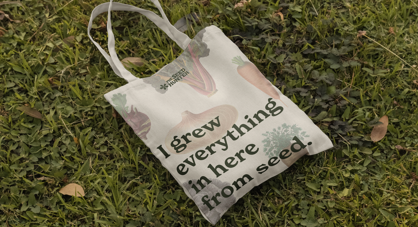
Strategy and visual direction to lay the creative groundwork for a new seed company.
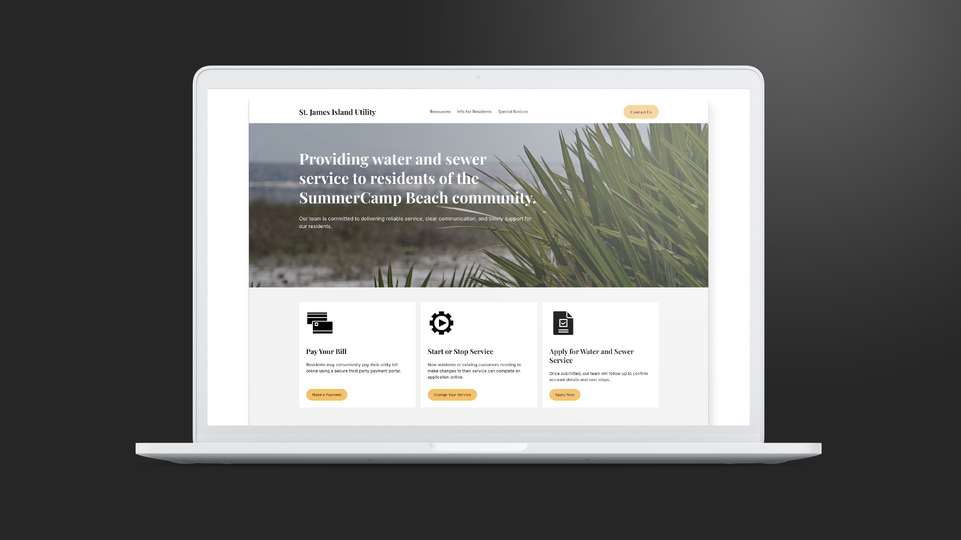
A neighborhood utility company needed a digital home base on Squarespace.