
Pages


Contact

Content
Motion Design
MarketWatch Video
Work
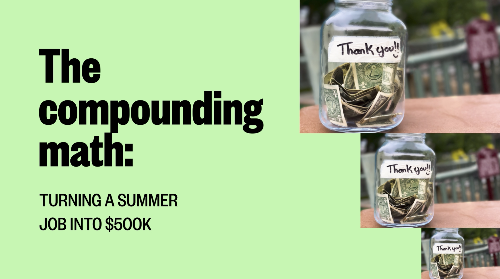
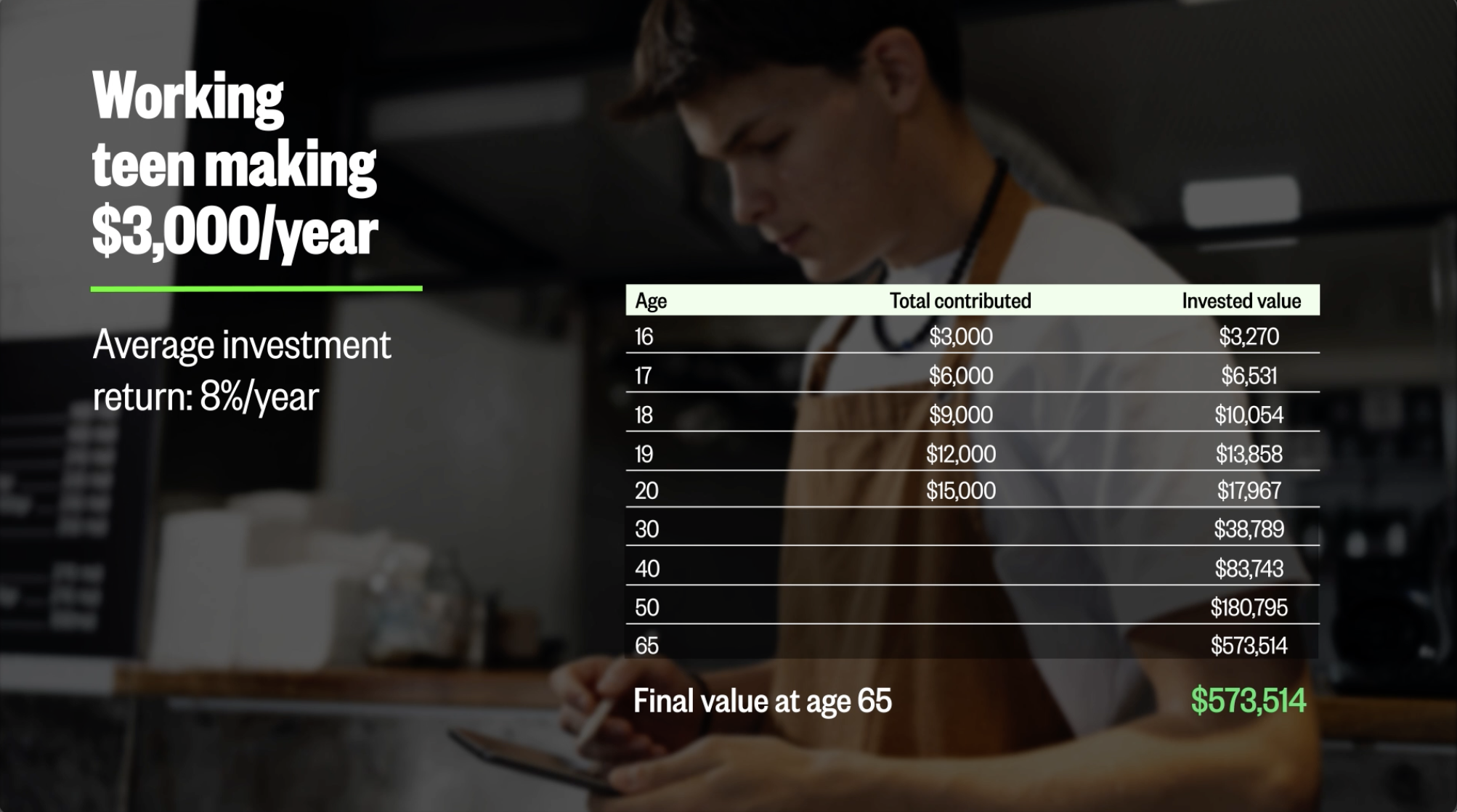
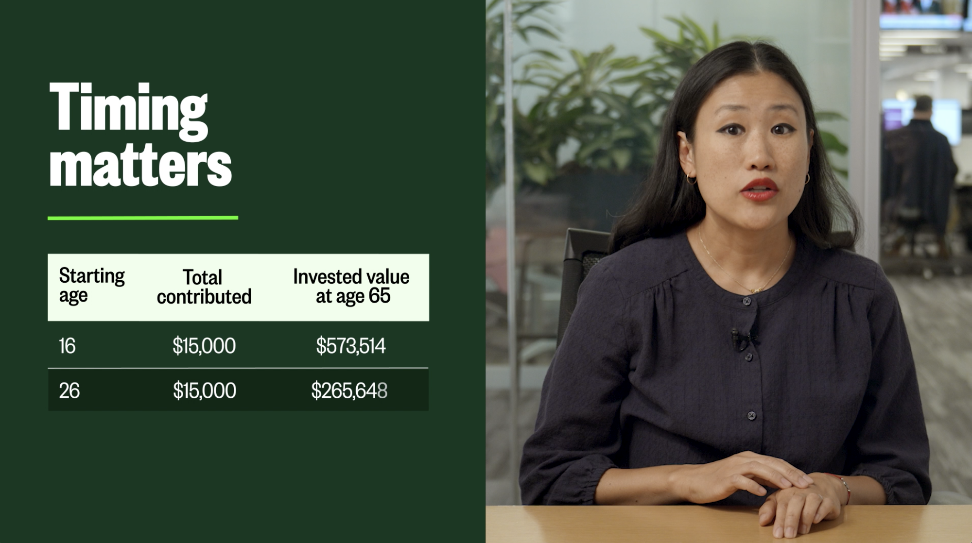
MarketWatch is fresh off a full identity redesign and campaign with Mother Design, built around a sharp concept: empowering people to grow their money through long-term patience and strategy.
It taps into a very stable and calculated feeling, but it doesn’t feel like a stuffy financial magazine. It's clearly made for a new generation — the colors, type, and layouts are electric, pulling directly from rave posters, of all things. I've been designing for the series since I was a staffer at MarketWatch nearly ten years ago, and I originally set the art direction for the series. It looks nothing like it did back then — a good thing! — and it's been genuinely cool to watch the brand grow, and a privilege to work on it through every stage.
MarketWatch
2 Weeks
Content, Motion design, Video Editing
The process


If you’re ready to show up like you mean it, let's talk.